Sneak Peek into DotVVM Tailwind UI 5.1
Published: 11/8/2026 3:29:44 PMCharts, stat cards, a new searchable ComboBox, filtering in GridView, file uploads, image cropping, and more than twenty other new controls. Here is what's coming in the next version of DotVVM Tailwind UI.
A few months ago, we released the first stable version of DotVVM Tailwind UI - a set of modern-looking components built with Tailwind CSS. Since then, we have been busy working on the most requested features: data visualization, richer form controls, and a lot of small building blocks you need in almost every line-of-business app.
Version 5.1 is almost ready, so let's take a look at the highlights.
Charts
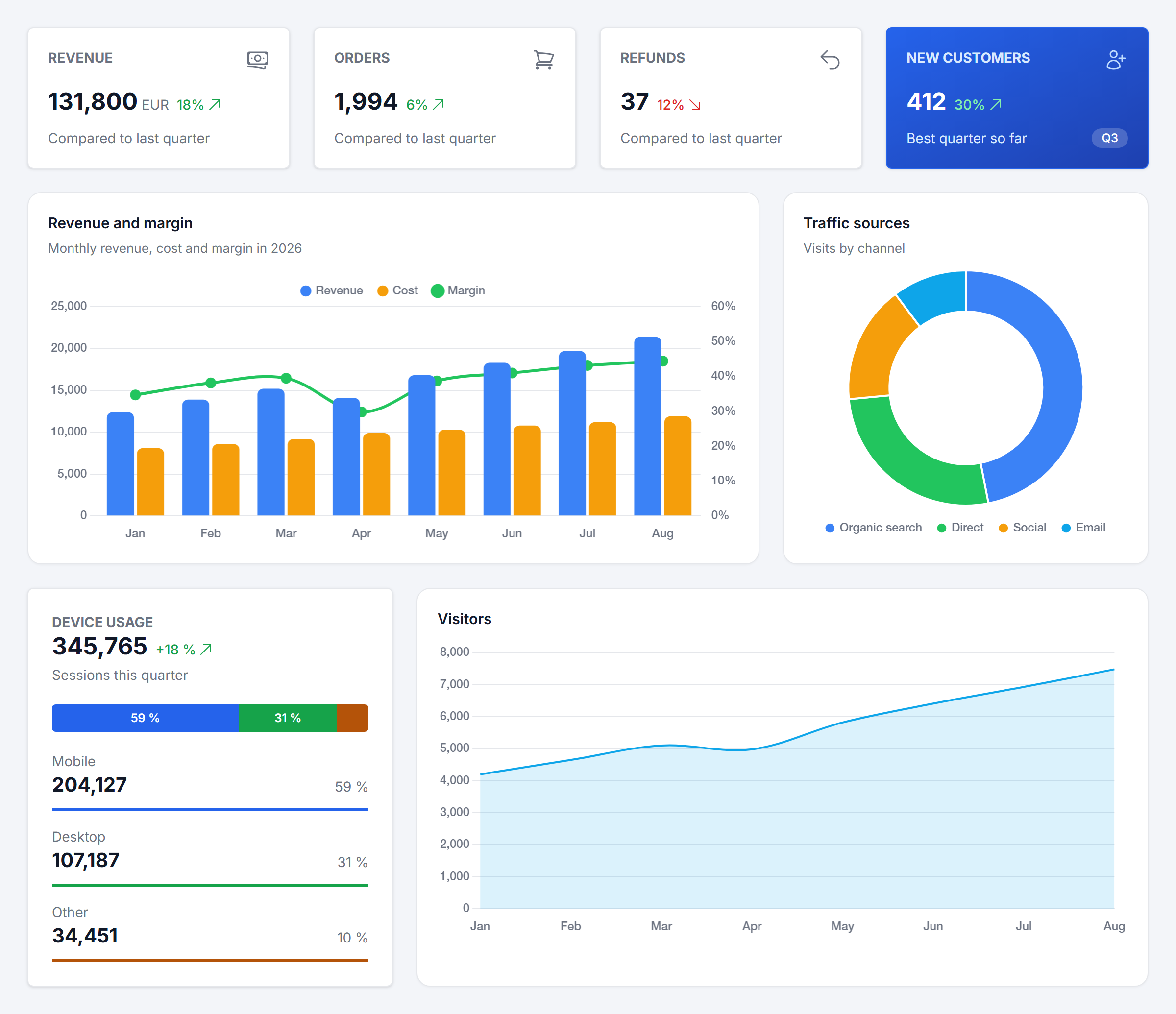
The biggest addition is a family of chart controls: BarChart, LineChart, DonutChart, PolarAreaChart, RadarChart, ScatterChart, and BubbleChart. They are built on top of Chart.js, but you don't need to write a single line of JavaScript - just bind the data from your viewmodel and describe the series in markup:
<t:BarChart DataSource="{value: Sales}" ItemLabel="{value: Month}" LegendPosition="Top"
            ValueFormat String="N0" SecondaryAxisFormatString="P0">
    <t:ChartSeries Name="Revenue" Value="{value: Revenue}" Color="Primary" />
    <t:ChartSeries Name="Cost" Value="{value: Cost}" Color="Warning" />
    <t:ChartSeries Name="Margin" Value="{value: (Revenue - Cost) / Revenue}"
                   Type="Line" Axis="Secondary" Color="Success" Smooth="true" />
</t:BarChart>
The charts react to changes in the viewmodel, so when you add an item to the collection or change a value, the chart animates to the new state. They support stacked and horizontal bars, mixed bar and line series, secondary axes, time axes, logarithmic scales, and the ItemClick command which lets you drill down into the data. The colors follow the semantic palette of your Tailwind theme, and if you need something special, you can pass any Chart.js option using the Option-* attributes.
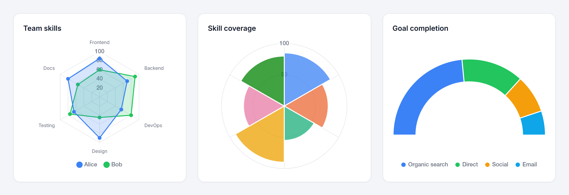
Chart.js is bundled in a separate script, which is loaded only on pages that contain a chart - the other pages of your app don't pay for it.
Stat cards
Every dashboard starts with a row of key metrics. The new StatCard control displays a value with an optional label, icon, change indicator, description, badge, and a progress bar or ring. Four layouts are available - Default, DiffIcon, Ring, and TopIcon - and every card can have a gradient background in any of your theme colors.
<t:StatCard Label="Revenue" Value="{value: Revenue}" FormatString="N0" Unit="EUR"
            Icon="Banknotes" Diff="18%" DiffDirection="Up"
            Description="Compared to last quarter" />

<t:StatCard Layout="Ring" Label="Storage" Value="{resource: 62}" Unit="GB"
            Progress="62" AccentColor="Warning" />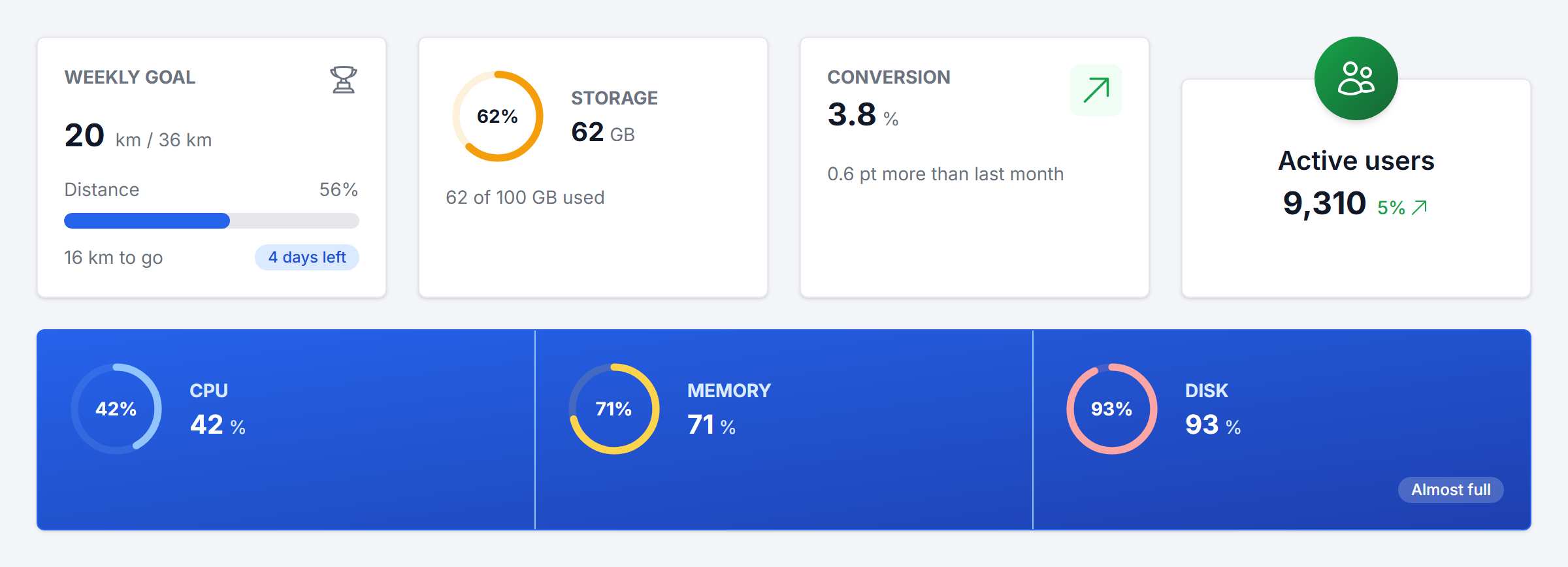
Use StatGroupedCard to place several metrics in a single card, and StatSegmentsCard to show how a total splits into parts (you can see it in the dashboard at the top of this post).
GridView filtering
The GridView control can now filter data. Use the new FilteredGridViewDataSet<T> in your viewmodel, and mark the columns which can be used for filtering:
<t:GridView DataSource="{value: Orders}">
    <Columns>
        <t:GridViewTextColumn HeaderText="Customer" ValueBinding="{value: Customer}"
                              AllowFiltering="true" Searchable="true" AllowSorting="true" />
        <t:GridViewTextColumn HeaderText="Total" ValueBinding="{value: Total}" AllowFiltering="true" />
        <t:GridViewDateColumn HeaderText="Created" ValueBinding="{value: CreatedDate}" AllowFiltering="true" />
        <t:GridViewCheckBoxColumn HeaderText="Paid" ValueBinding="{value: IsPaid}" AllowFiltering="true" />
    </Columns>
</t:GridView>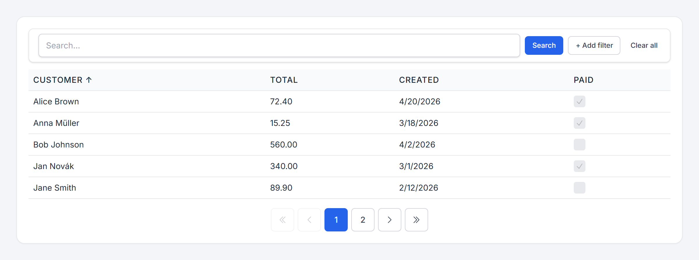
The grid displays a search box and a button for adding filters. The available operators depend on the column type - text columns offer contains or starts with, numbers and dates offer ranges, and enum collections offer is any of. The filters are translated to an IQueryable expression, so they work with Entity Framework and are evaluated in the database together with sorting and paging.
We have also added new Tailwind column types: GridViewDateColumn and GridViewDateTimeColumn (with the Tailwind date picker in the edit mode), GridViewCheckBoxColumn, and GridViewMultiSelectColumn for collections of enum values.
Better form controls
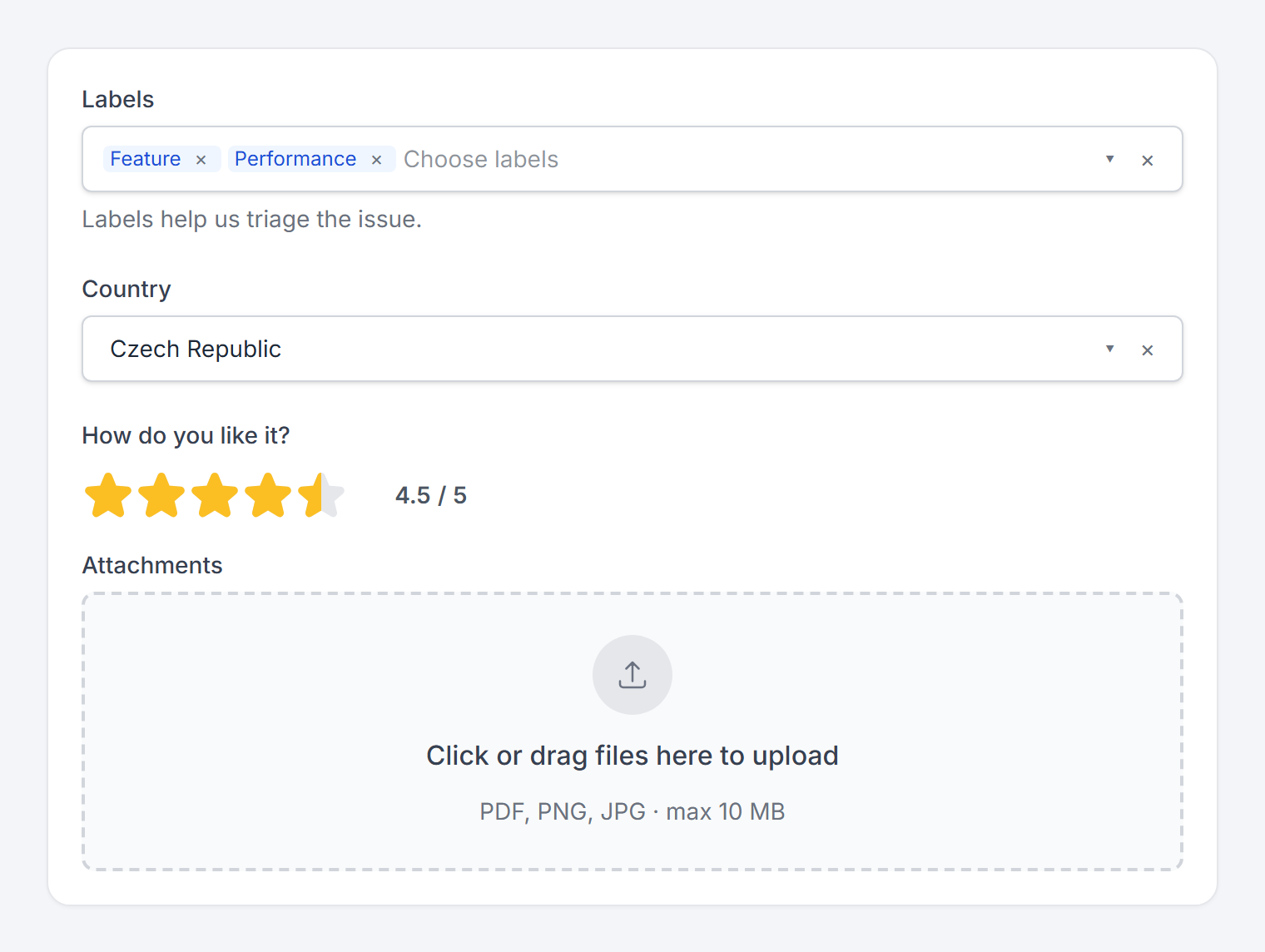
The ComboBox was rewritten from scratch. It is now a searchable selector with full keyboard support, and it can call a static command to search for items on the server - perfect for long lists of customers or products. A new MultiSelect control with the same API lets the user pick multiple values.
<t:MultiSelect DataSource="{value: Countries}" SelectedValues="{value: SelectedCountries}"
               ItemTextBinding="{value: Name}" ItemKeyBinding="{value: Code}"
               Search="{staticCommand: (string q) => CountryService.Search(q).Result}" />
All form fields now share the same set of properties, including the new HelpText. And there are two more input controls - Rating for star ratings with half-point precision, and FileUpload with a drag-and-drop zone, client-side validation, and a compact mode for forms.
Building blocks for AI-powered apps
Many of our customers are adding AI features to their apps, and they all need the same thing: a prompt input. The new TextBoxGroup control lets you compose a text box with buttons, drop-downs, and file previews into a single input - just like the ones you know from ChatGPT or GitHub Copilot.
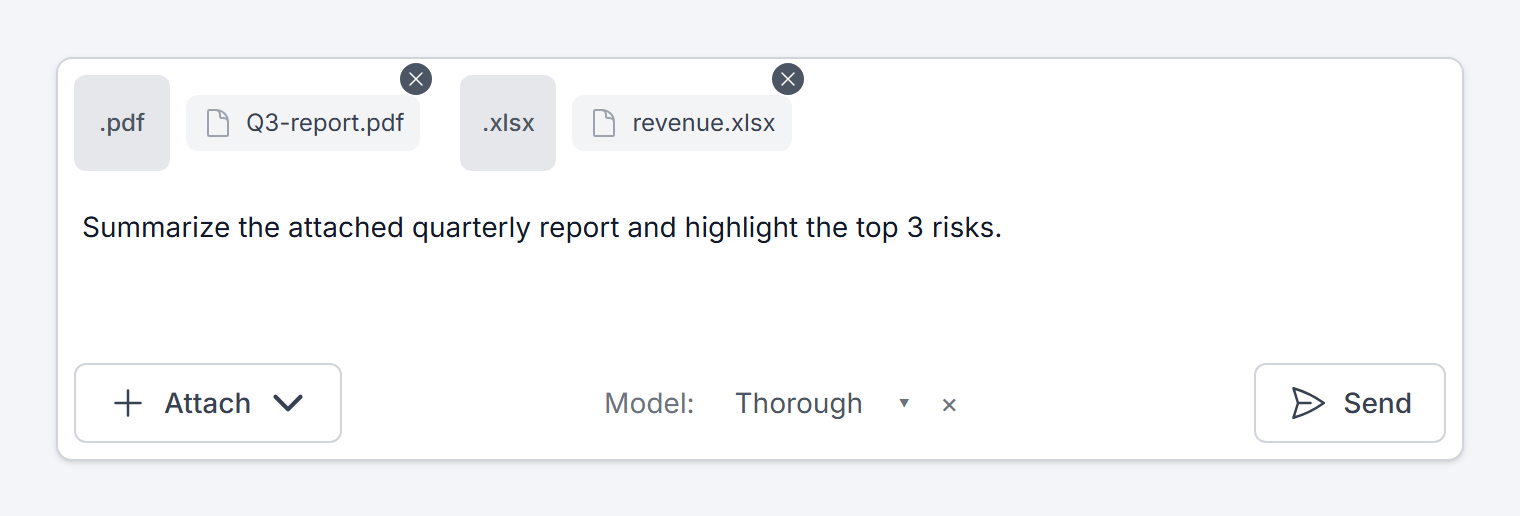
To display the AI responses, use the new TextView control. It renders plain text or Markdown, turns URLs into links, and never renders raw HTML, so it is safe for any user- or AI-generated content.
Images
The ImageCrop control is a complete image editor - the user can pick an image from a file, paste it from the clipboard, or load it from a URL, and then crop, zoom, rotate, and flip it. It is perfect for profile pictures (including circular crops) or product photos. The original image and the cropped result are stored separately, so the user can return and adjust the crop later.
Since you should never trust the images coming from the client, the package also contains the ImageService class which validates and re-encodes the image on the server:
var bytes = await new ImageService().ProcessImageAsync(stream,
    o => o.HasFormat(ImageFormat.Jpeg).HasMaxDimensions(1000, 1000));
Popover, Collapse, and drag & drop
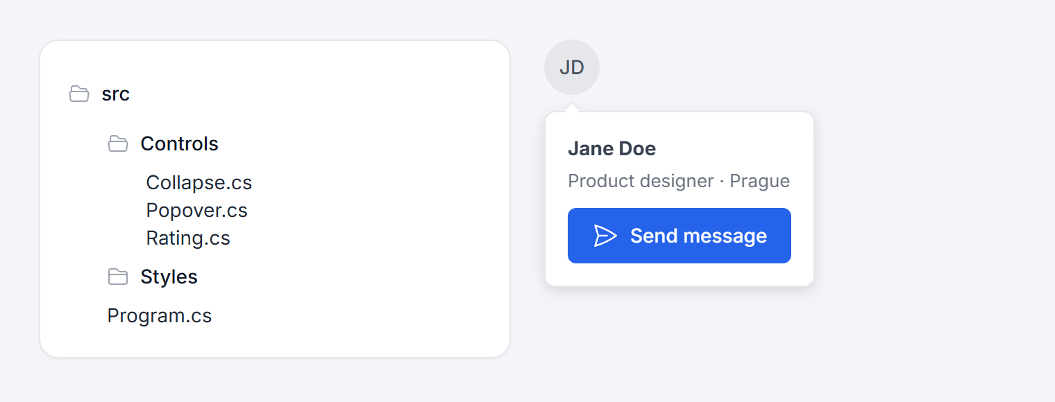
Popover displays a floating panel next to any element and opens on click or hover. It positions itself automatically, and its open state can be bound to the viewmodel. Collapse is a standalone collapsible section - and with the Tree type and custom icons, you can easily build a file tree.
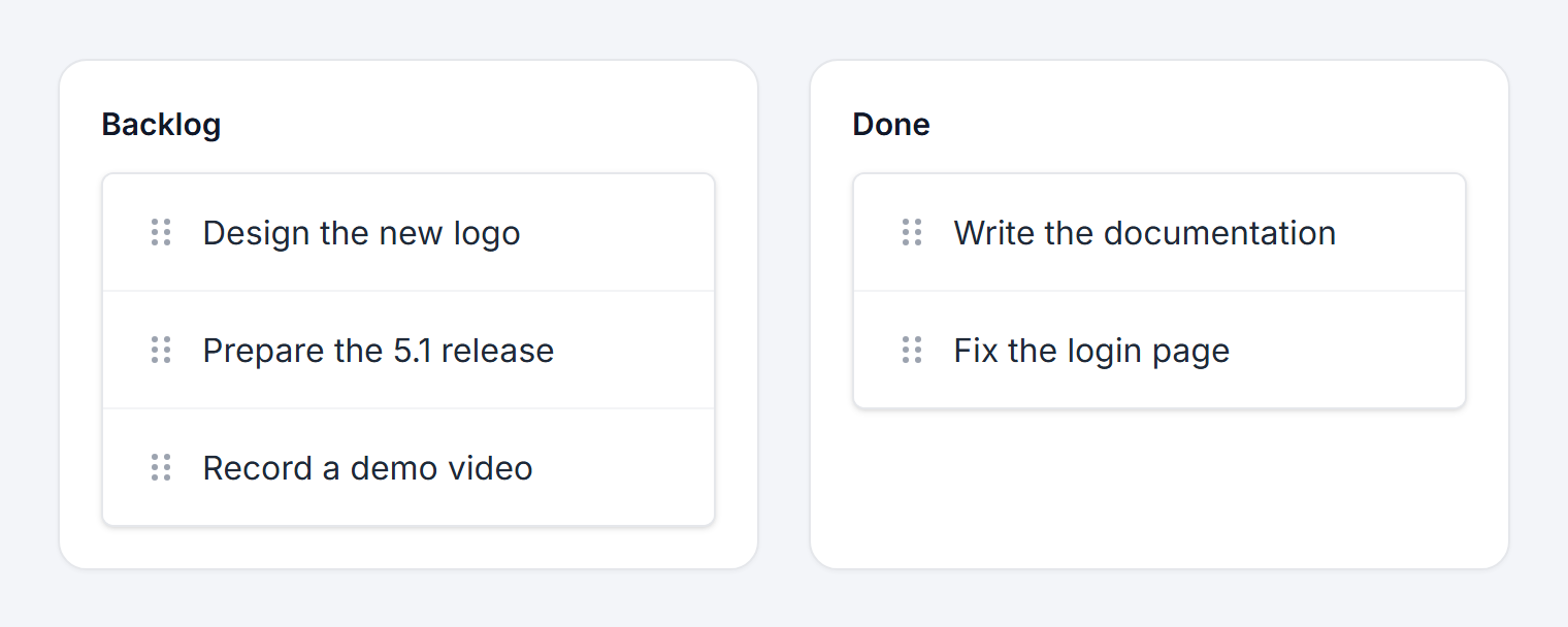
DraggableList lets the user reorder items by dragging them (or using the keyboard), and move them between lists. The collections in your viewmodel are updated automatically.
Skeletons and layout
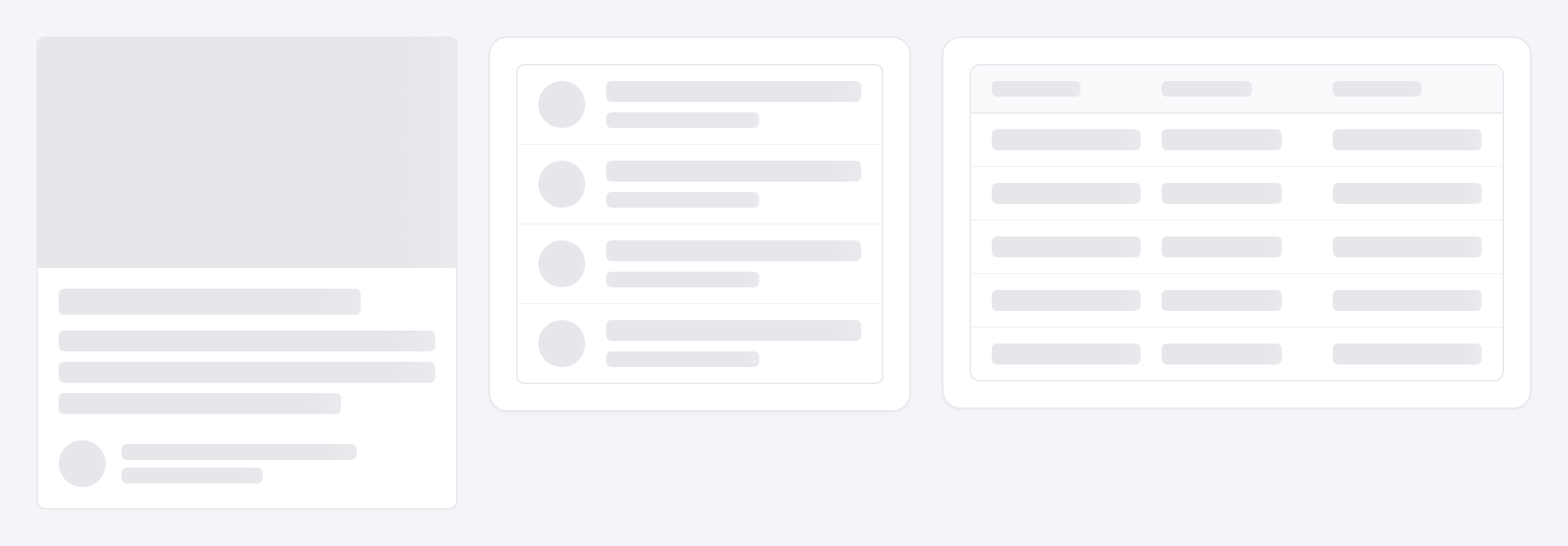
Loading data takes time, and the new skeleton placeholders - SkeletonCard, SkeletonList, SkeletonParagraph, and SkeletonTable - make the waiting look much nicer than a spinner.
And finally, the new GridLayout control arranges its content in a responsive grid. Just say how many columns you want at each breakpoint:
<t:GridLayout Columns="1" ColumnsSM="2" ColumnsLG="4" Gap="Large">
    ...
</t:GridLayout>
And there's more
- Localization - all built-in texts of the controls are now localized. The package comes with English and Czech, and you can add other languages or override individual texts by implementing
ITailwindTextProvider. - Theming - the sample app contains a new guide showing how to customize colors, fonts, corner radius, and layout dimensions using CSS variables, for the whole app or just a part of the page.
- DateTimePicker follows
CurrentCulturefor the input format, and has a newUICultureproperty for the calendar language. - ListGroup items don't need to be clickable anymore, and Notifications are displayed above open modal dialogs.
Version 5.1 contains a few breaking changes - most notably, the ComboBox doesn't inherit from the built-in DotVVM control anymore, and the HTML attributes applied to inputs in form fields now use the Control- prefix. See the release notes for the complete list.
Try it out
DotVVM Tailwind UI 5.1 will be published on our private NuGet feed in the coming weeks. If you don't have a license yet, you can request a 30-day trial and try all the new components in your project.
The documentation of all the new controls is already available in the Tailwind UI section of our docs. We'd love to hear your feedback - let us know what you think on our forum.

I am the CEO of RIGANTI, a small software development company located in Prague, Czech Republic.
I am Microsoft Most Valuable Professional and the founder of DotVVM project.