Model metadata
The easiest way of providing metadata to properties in model classes is to use Data annotation attributes.
Supported attributes
Auto UI supports several of these attributes and adds a few of its own attributes for features which are not covered by the standard ones.
| Attribute | Namespace | Property | Fluent API methods | Meaning | |
|---|---|---|---|---|---|
Display |
System.ComponentModel.DataAnnotations |
AutoGenerateField |
Hide, SetAutoGenerateField |
Specifies whether the field should be generated or not. | |
Display |
System.ComponentModel.DataAnnotations |
Name |
SetDisplayName |
Provides the label text for the field. If you set also the ResourceType property, the value will be looked up in the specified RESX file. |
|
Display |
System.ComponentModel.DataAnnotations |
Prompt |
Provides the placeholder text for empty field. If you set also the ResourceType property, the value will be looked up in the specified RESX file. |
||
Display |
System.ComponentModel.DataAnnotations |
Description |
Provides the description text for the field. If you set also the ResourceType property, the value will be looked up in the specified RESX file. |
||
Display |
System.ComponentModel.DataAnnotations |
Order |
SetOrder |
Provides the order of the field. If the property is not set, Auto UI will list the properties in the order they were declared in the class. | |
Display |
System.ComponentModel.DataAnnotations |
GroupName |
SetGroupName |
Assigns the field in a group. The Form and GridViewColumns controls can specify the GroupName property to include only properties from a specific group. |
|
DisplayFormat |
System.ComponentModel.DataAnnotations |
DataFormatString |
SetFormatString |
Specifies the format string for the field value. | |
DisplayFormat |
System.ComponentModel.DataAnnotations |
NullDisplayText |
SetNullDisplayText |
Specifies the text to be displayed when the field is null. | |
DataType |
System.ComponentModel.DataAnnotations |
DataType |
SetDataType |
Specifies more precise classification of the field value which is reflected by the generated control (e. g. Password, MultilineText, Url...) |
|
Editable |
System.ComponentModel.DataAnnotations |
AllowEdit |
SetIsEditable |
Specifies whether the field can be edited or not. | |
Enabled |
DotVVM.AutoUI.Annotations |
IsAuthenticated |
EnableIfAuthenticated |
Specifies whether the field should be editable for authenticated or non-authenticated users, or for both (default behavior). | |
Enabled |
DotVVM.AutoUI.Annotations |
Roles |
EnableForRoles |
Specifies a name of the role or an expression that specifies for which roles the field should be editable. You can use ! (NOT), & (AND) and | (OR) operators. |
Enabled |
DotVVM.AutoUI.Annotations |
ViewNames |
EnableForViews |
Specifies a name of the view or an expression that specifies for which views (set with the ViewName property on the Form and GridViewColumns controls) the field should be editable. You can use ! (NOT), & (AND) and |
(OR) operators. |
Selection |
DotVVM.AutoUI.Annotations |
SelectionType |
SetSelection |
Defines that the user will be selecting the value from a list of options, and defines the type of selection. A service implementing ISelectionProvider<TSelectionType> must be provided. See the Selectors chapter for more info. |
|
Styles |
DotVVM.AutoUI.Annotations |
FormControlContainerCssClass |
AddFormControlContainerCssClass |
Specifies the CSS class applied to the container of the form control (e.g. table cell which contains the TextBox control) for this field. | |
Styles |
DotVVM.AutoUI.Annotations |
FormRowCssClass |
AddFormRowCssClass |
Specifies the CSS class applied to the row in the form (e.g. table row which contains the label and the TextBox control) for this field. | |
Styles |
DotVVM.AutoUI.Annotations |
FormControlCssClass |
AddFormControlCssClass |
Specifies the CSS class applied to the control in the form. | |
Styles |
DotVVM.AutoUI.Annotations |
GridCellCssClass |
AddGridCellCssClass |
Specifies the CSS class applied to the GridView table cell for this field. | |
Styles |
DotVVM.AutoUI.Annotations |
GridHeaderCellCssClass |
AddGridHeaderCellCssClass |
Specifies the CSS class applied to the GridView table header cell for this field. | |
Visible |
DotVVM.AutoUI.Annotations |
IsAuthenticated |
ShowIfAuthenticated |
Specifies whether the field should be visible for authenticated or non-authenticated users, or for both (default behavior). | |
Visible |
DotVVM.AutoUI.Annotations |
Roles |
ShowForRoles |
Specifies a name of the role or an expression that specifies for which roles the field should be visible. You can use ! (NOT), & (AND) and | (OR) operators. |
Visible |
DotVVM.AutoUI.Annotations |
ViewNames |
ShowForViews |
Specifies a name of the view or an expression that specifies for which views (set with the ViewName property on the Form and GridViewColumns controls) the field should be visible. You can use ! (NOT), & (AND) and |
(OR) operators. |
UIHint |
System.ComponentModel.DataAnnotations |
UIHint |
SetUIHint |
Specifies a identifier or a custom editor control which will be used for the property. This attribute can be specified multiple times to provide multiple UI hints. |
Convention-based approach
Often, you may want to set the metadata based on naming or other conventions instead of polluting your code with several attributes on each property.
Auto UI offers a fluent API which can easily set the convention to all properties satisfying a specified condition.
This configuration is done in DotvvmStartup.cs when registering the Auto UI:
options.AddAutoUI(config => {
    config.PropertyMetadataRules
        .For(typeof(decimal), rule => rule.SetFormatString("n2"))
        .For("Id", rule => rule.Hide())
        .For(prop => prop.Name.EndsWith("ImageUrl"), rule => rule.SetUIHint("ImageUpload"));
});
- The first rule says that all properties of
decimalwill use the"n2"format string. - The second rule says that all properties with name
Idwill be hidden ([Display(AutoGenerateField = false)]). - The third rule says that all properties with name ending with
ImageUrl(for exampleCustomerImageUrl,ProfileImageUrland so on) will get[UIHint("ImageUpload")]which will instruct the control to use a custom component for uploading the image (see the Extensibility chapter for more info).
There are methods in config.PropertyMetadataRules which help to set each property of each supported attribute from the table above.
Resource file for field labels
The most common scenario is to set field labels by using the [Display(Name = "xxx")] attribute. If you want to localize the field label, you also need to specify the ResourceType property.
Adding the Display attribute to every property in every model class can be annoying, that's why Auto UI offers a way to provide a RESX file with localizations for all fields. If no Display attribute is specified, the field name will be looked up in the RESX file.
For a property called CustomerName in a class called CustomerDetailModel, Auto UI will first look for a key CustomerDetailModel_CustomerName. If it doesn't find it, it will look just for CustomerName. If even the second key is not found, Auto UI will try to make human-friendly name using the library Humanizer.
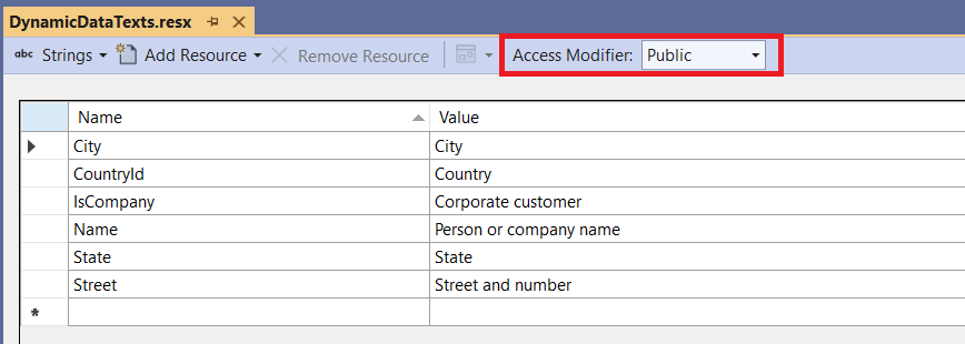
Please make sure you have set the Access Modifier in the default language RESX file to Public. Naturally, you can add additional resource files for each culture - for example ResourceFileName.de-DE.resx and so on.
To use the resource file, you need to specify it in DotvvmStartup.cs when registering Auto UI:
options.AddAutoUI(config => {
    config.PropertyDisplayNamesResourceFile = typeof(YourResourceFile);
});
Resource file for validation error messages
The same applies for error messages produced by validation attributes. For example, if you want to change the default error message for all Required attributes in your application, you can create another resource file with the validation error messages. They can use the {0} placeholder in which the field label will be substituted.
The key is always the attribute name without the Attribute suffix (e. g. Display, ...).
Resource Key            Value
-------------------------------------------------------------------------------------
Required                {0} is required!
EmailAddress            {0} is not a valid e-mail address!
...
Again, you can add additional resource files for each culture - for example ResourceFileName.de-DE.resx and so on.
options.AddAutoUI(config => {
    config.ErrorMessagesResourceFile = typeof(YourResourceFile);
});
Implementing your own metadata provider
Auto UI determines the metadata using its own implementation of IPropertyDisplayMetadataProvider. You can implement your own version (and possibly inherit from DataAnnotationsPropertyDisplayMetadataProvider) and register it in the service collection.
Please note that if you are using the resource files for providing field labels or error messages, you'll also need to wrap your implementation into the ResourcePropertyDisplayMetadataProvider before registering it in the service collection.