Markup controls
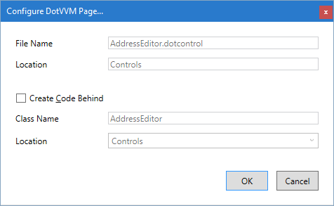
It is very easy to create a markup control. First, you need to create a file with the .dotcontrol extension.
Create a markup control
Simple markup controls don't need any C# code. In Visual Studio, right click on a project or folder in the Solution Explorer window, and select Add > New Item.
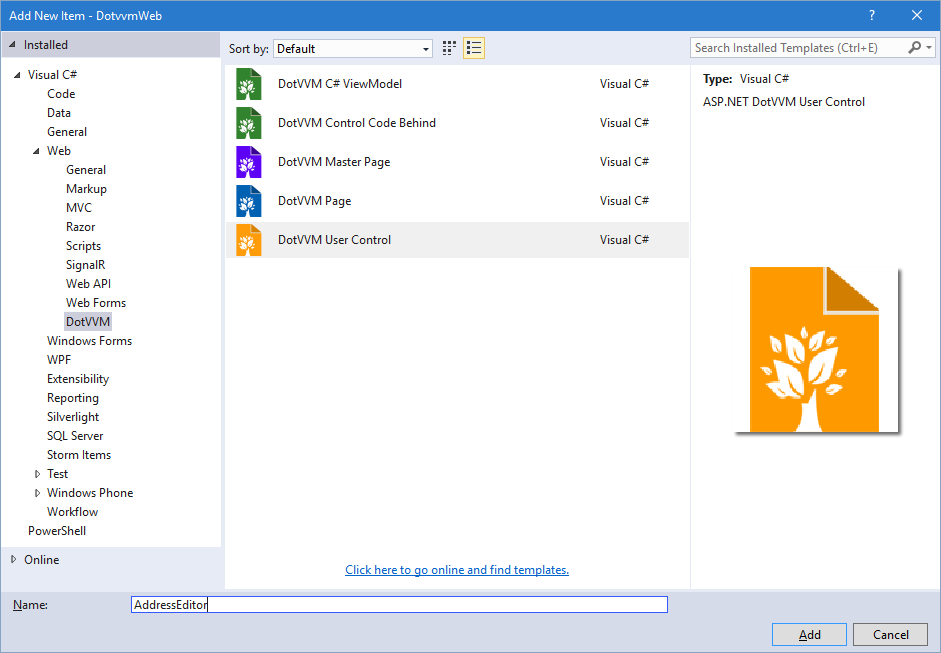
In the next window, keep the defaults and proceed.
Extract markup control from page
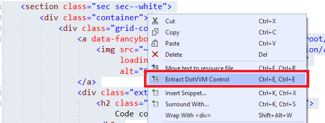
Sometimes, you want to use the markup controls to keep your page markup shorter and cleaner.
You can select a part of DotHTML markup, right-click on it, and select the Extract markup-control option.
Markup control structure
The .dotcontrol file can look like this:
@viewModel DotvvmDemo.Model.IAddress, DotvvmDemo

<table>
    <tr>
        <td>Street: </td>
        <td><dot:TextBox Text="{value: Street}" /></td>
    </tr>
    ...
    <tr>
        <td>Country: </td>
        <td>
        <dot:ComboBox DataSource="{value: Countries}"
                      SelectedValue="{value: CountryId}"
                      ItemTextBinding="{value: Name}"
                      ItemValueBinding="{value: Id}" />
        </td>
    </tr>
</table>
Binding context type
The markup control files must specify the @viewModel directive which tells DotVVM in which binding context the control will be used. It can be an interface or a base class, but the control needs to know on which type the data-bindings are evaluated.
You can see that the control above requires a binding context of type IAddress. It can be used on any place where the DataContext implements this interface.
Remember that neither markup controls nor master pages create an instance of the viewmodel. Only pages have their own viewmodel instance. In master pages and markup controls, the
@viewModeldirective specifies the "contract" for the viewmodel - a base class of the viewmodel, or interface that the viewmodel must implement.
If your markup control doesn't contain any data-bindings and doesn't depend on a specific viewmodel, use @viewModel System.Object, mscorlib. It means that the control can be used in any binding context.
Control wrapper tag
Markup controls are wrapped inside a div tag by default. You can specify the tag you want to use by adding @wrapperTag directive.
If you don't want to use any wrapper tag you can add the @noWrapperTag directive.
@viewModel DotvvmDemo.Model.IAddress, DotvvmDemo
@wrapperTag table

<tr>
    <td>Street: </td>
    <td><dot:TextBox Text="{value: Street}" /></td>
</tr>
...
<tr>
    <td>Country: </td>
    <td>
        <dot:ComboBox DataSource="{value: _control.Countries}"
                      SelectedValue="{value: CountryId}"
                      ItemTextBinding="{value: Name}"
                      ItemValueBinding="{value: Id}" />
    </td>
</tr>
This will render the control inside the table tag.
Register the markup control
In order to use the control, you need to register it in the DotvvmStartup.cs file. You can choose your own prefix and name for the control, e. g. cc:AddressEditor.
Then, the control can be used in the page like this:
<cc:AddressEditor DataContext="{value: ShippingAddress}" />
<cc:AddressEditor DataContext="{value: BillingAddress}" />
See the Markup control registration chapter for more info.
Add custom properties to the control
The markup controls can declare custom properties, e. g. for passing additional information aside of the DataContext.
<cc:AddressEditor DataContext="{value: ShippingAddress}" Countries="{value: Countries}" />
Inside the control, you can then access these properties using the _control binding property:
<dot:ComboBox DataSource="{value: _control.Countries}" />
See the Markup controls with code-behind chapter for more info.