Markup controls
It is very easy to create a markup control. First, you need to create a file with the .dotcontrol extension.
Create a markup control
Simple markup controls don't need any C# code. In Visual Studio, right click on a project or folder in the Solution Explorer window, and select Add > New Item.
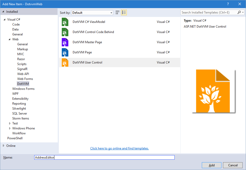
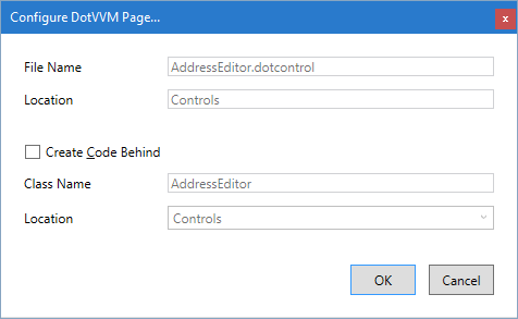
In the next window, keep the defaults and proceed.
Extract markup control from page
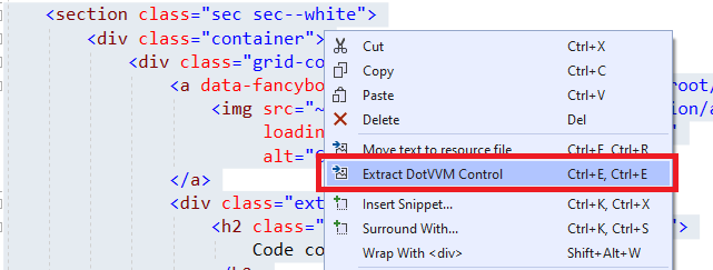
Sometimes, you want to use the markup controls to keep your page markup shorter and cleaner.
You can select a part of DotHTML markup, right-click on it, and select the Extract markup-control option.
Register the markup control
In order to use the control, you need to register it in the DotvvmStartup.cs file. You can choose your own prefix and name for the control, e. g. cc:AddressEditor.
Then, the control can be used in the page like as <cc:AddressEditor DataContext={value: ShippingAddress} />
Markup control structure
The .dotcontrol file can look like this:
@viewModel DotvvmDemo.Model.IAddress, DotvvmDemo

<table>
    <tr>
        <td>Street: </td>
        <td><dot:TextBox Text={value: Street} /></td>
    </tr>
    ...
    <tr>
        <td>Country: </td>
        <td>
        <dot:ComboBox DataSource="{value: Countries}"
                      SelectedValue="{value: CountryId}"
                      ItemTextBinding="{value: Name}"
                      ItemValueBinding="{value: Id}" />
        </td>
    </tr>
</table>
Binding context type
The markup control files must specify the @viewModel directive which tells DotVVM in which binding context the control will be used. It can be an interface or a base class, but the control needs to know on which type the data-bindings are evaluated.
You can see that the control above requires a binding context of type IAddress. It can be used on any place where the DataContext implements this interface.
Remember that neither markup controls nor master pages create an instance of the viewmodel. Only pages have their own viewmodel instance. In master pages and markup controls, the
@viewModeldirective specifies the "contract" for the viewmodel - a base class of the viewmodel, or interface that the viewmodel must implement.
If your markup control doesn't depend on a specific viewmodel, use @viewModel object. It means that the control can be used in any binding context.
Properties
The markup control can specify any number of control properties, for passing additional information aside of the DataContext.
Properties may contain static values, value binding or commands and are used as HTML attributes.
The property can be declared:
- By using the
@propertydirective (supported in DotVVM 4.1 and newer) - In the code-behind file of the control
Declare the property using the @property directive
The @property directive can specify the name and type of the property, its default value, as well as the properties of the MarkupOptions attribute.
@property string Title = "Panel"
@property List<CategoryModel> Categories, MarkupOptionsAttribute.AllowHardCodedValue = false
@property Action<CategoryModel> CategoryAdded
@property string[] CategoryTypes = [ "default", "premium", "extra" ]
- The first declaration creates a
stringproperty namedTitle. If the user doesn't set this property in the page where the control is used, the default value will be"Panel" - The second declaration creates a property named
Categoriesof typeList<CategoryModel>. It also appliesMarkupOptions.AllowHardCodedValuetofalse, which means that the property will only accept a binding expression. - The third declaration creates a property
CategoryAddedof typeAction<CategoryModel>. This property can be set with a command or static command binding. - The fourth declaration creates a property
CategoryTypesof typestring[]. If this property is not set, a default value (array with"default","premium", and"extra") will be used.
Use the custom property
In the page where the control is used, you can specify the property as an attribute (default behavior), or as an inner element (if you've set the MappingMode property to InnerElement). Whether the property accepts binding expressions or hard-coded values can be specified using the AllowBinding and AllowHardCodedValues properties of the MarkupOptions attribute.
<cc:AddressEditor DataContext="{value: ShippingAddress}"
                  Countries="{value: Countries}" />
In the control markup file, you can access these properties using the _control binding property:
<dot:ComboBox DataSource="{value: _control.Countries}" />
The same rule about when to use value binding or resource binding is applied here:
- If the property can contain a binding expression and you want to pass that expression to a control inside the markup control, use
valuebinding. - If the property contains a hard-coded value, or the target property doesn't support binding expressions (e. g.
RouteNameof the RouteLink, use theresourcebinding.
Control wrapper tag
Markup controls are wrapped inside a div tag by default. You can specify the tag you want to use by adding @wrapperTag directive.
If you don't want to use any wrapper tag you can add the @noWrapperTag directive.
@viewModel DotvvmDemo.Model.IAddress, DotvvmDemo
@wrapperTag table

<tr>
    <td>Street: </td>
    <td><dot:TextBox Text="{value: Street}" /></td>
</tr>
...
<tr>
    <td>Country: </td>
    <td>
        <dot:ComboBox DataSource="{value: _control.Countries}"
                      SelectedValue="{value: CountryId}"
                      ItemTextBinding="{value: Name}"
                      ItemValueBinding="{value: Id}" />
    </td>
</tr>
This will render the control inside the table tag.
Interact with JavaScript code using @js directive
Markup controls can seamlessly integrate with custom JavaScript code using the @js directive.
It will create an instance of the view module for each instance of the markup control.
See the @js directive / view modules documentation for more information.