Developer Story: Quest to conquer the DateTime selection
Published: 10/19/2017 11:15:00 AMHi, my name is Michal and I must confess something to you. I am obsessed with calendars and time selection tools. This obsession started more than a year ago when I was given the task of creating DateTime controls for our new Business Pack set of controls. This task seemed to be quite easy and straightforward, the web is full of different calendar controls so it should have been just a matter of choosing some good ones and creating similar controls for DotVVM. Task for a week at maximum. But there was a catch.

With DotVVM Business Pack we try to allow developers to use our controls for every scenario. From simple birth date selector for your everyday registration form to complex datetime range picker for booking systems which may need support for dynamically changing set of available dates.
As the development went on, the calendar got many new features: DateTime range selection, mininum and maximum dates, advanced configurable rules and a few more.
It all worked quite well. But it did not look and feel as good as we would wish. Simple calendar UI became cluttered with numerous selection layers and the whole calendar could operate in multiple modes. It turned into a control which you needed a written manual for. So, I got back to the drawing board.
One of our problems was how to let user know what to do when he tried to select invalid date and time selection.
Using multiple colors for different cell states solved the problem with invalid date in selection with ease.
We ended up with using three different colors for invalid dates:
- grey for invalid cells outside the current selection
- dark red for date in selection which causes the selection to be invalid
- lighter tone of red for indicating that selection cannot be made because it contains disabled date(s)
Another problem was the UX of time selection. This problem has proven to be more challenging, because every member of the team had a different opinion on how the time selection should look.
The time selection is divided into two separate stages in the current version:
- hour section
- time selection
The UI transformed for the respective stages, which was confusing for many users.
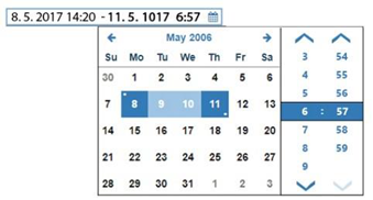
Currently we are trying to solve this by rethinking the way how we select time. We have eliminated the multiple steps time selection and replaced it by selecting time in a single "form" which shows side by side with calendar when you are required to select the time.
This will allow us to simplify the time selection in all possible configurations. When only time is needed we can show just the time picker. When you need date and time we use calendar with time picker on the side. And for selecting complex ranges we let users to select start DateTime and then end DateTime instead of single selection, which would be too complex.
I am really looking forward to publish this new version to you alongside with many other improvements and new controls. Do you have any idea how to improve any of our controls? Is there any which is not easy to use? There isn’t anything more important to us than the user experience so let me know how we can improve it. Please feel free to contact us on our Gitter.

.NET Developer
Working on DotVVM controls (Bootstrap & BusinessPack) since alpha release of DotVVM.


