Have you met DotVVM Contrib controls?
Published: 8/13/2019 2:01:00 PMAll DotVVM users are probably familiar with Bootstrap for DotVVM and DotVVM BusinessPack. Those easy-to-use controls are a big part of why we think of DotVVM as an easy to learn & use framework. But did you know that those two control packs have a little sibling? Let me introduce you to DotVVM Contrib controls - collection of free and open-source controls developed and maintained by our community.
Currently, the DotVVM Contrib repo contains 15 controls including the recently added GoogleMap and QrCode controls. All are available as separate NuGet packages named DotVVM.Contrib.ControlName.
List of controls
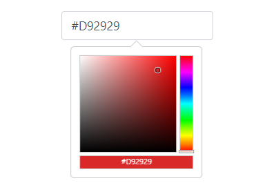
- BootstrapColorpicker – a simple color picking control with Bootstrap look&feel
- BootstrapDatepicker – a simple date selection control with Bootstrap look&feel
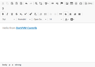
- CkEditorMinimal – a wrapper for a popular CKEditor 4
- CrystalReportViewer – a component which can display ASP.NET Web Forms Crystal Report viewer in an iframe
- FAIcon – render any FontAwesome icon you need
- GoogleAnalyticsJavascript – embed Google Analytics tracking code
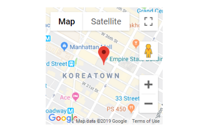
- GoogleMap – embed Google Map with binding just an address
- LoadablePanel – lazy-loads parts of the viewmodel after the page is loaded
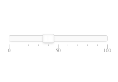
- NoUiSlider – a slider control (wrapper of the NoUISlider library)
- PolicyView – shows or hides content based on current user claims and policies
- QrCode – renders a QR code based on a provided value
- ReactBridge – allows to embed React controls and bind them to the DotVVM viewmodels
- Select2 – renders a popular selection control (wrapper of the Select2 library)
- TemplateSelector – displays one of the set of templates based on a value
- TypeAhead – renders a popular auto completion control (wrapper of the TypeAhead library)
Let me show you some examples of the controls.
<dc:CkEditorMinimal Html="{value: Text}" /><dc:BootstrapColorpicker Color="{value: Color}" /><dc:GoogleMap Address="{value: Address}" /><dc:QrCode Content="{value: CodeText}" /><dc:Slider MinValue="0" MaxValue="100"
Step="10"
Value="{value: SliderValue}"
Orientation="Horizontal" />How to use the controls
First, look for the DotVVM.Contrib.ControlName package and install it in the project.
Then, just register the control in DotvvmStartup.cs, e.g.:
config.AddContribBootstrapColorpickerConfiguration();Now you can find the control it with the <dc: prefix.
Submit your own controls
DotVVM component-based approach allows to create stand-alone components that ship with its styles, scripts and other resources as a simple NuGet package.
We will be happy for any pull requests in this repository. It is easy to add a new control – there is a “dotnet new” template which already includes a project for the control itselt, a simple web application project to make sure that the control is working correctly, and a project with Selenium UI tests. We’ll be happy to help with any piece in this process.
We hope that DotVVM Contrib controls will be useful for you. And of course, we are eager to hear your feedback.

.NET Developer
Working on DotVVM controls (Bootstrap & BusinessPack) since alpha release of DotVVM.
